How to Create Exceptional Web Experiences: A Comprehensive Guide to User-Centric Design and Development
.
14 minutes
Introduction
With users expecting seamless and intuitive experiences on the web, prioritizing their needs has become a non-negotiable aspect of building exceptional applications. So, this comprehensive guide is your blueprint to fully understand the art of user-first web application development. We will examine actionable strategies and hands-on techniques that will empower you to create web applications that not only meet user expectations but exceed them.
User-Centric Design: Foundation of an Intuitive Web Application
User-centric design isn’t a luxury; it’s the cornerstone of success in modern times web development. For it to really come into fruition, the key lies in immersing yourself in the shoes of your users when they’re using your application. That means creating detailed user personas for your prospective user. Suppose you’re building a Software as a Service (SaaS) product for task management, you can visualize a user who is a 9-to-5 individual that will be needing your product. Now, how does this user journey work? You can start by mapping out his journey from landing on your homepage to subscribing to your SaaS product and even becoming a loyal returning user. This means understanding his pain points and desires which will give you the insight needed to tailor the application to his needs. So, let’s explore the journey of an average 9-to-5 individual named “Office-Goer Owen.”
Initial Interaction:
Suppose Owen visits your website during his lunch break and he is looking for a quick solution to help him manage his work tasks more efficiently. The homepage needs to quickly convey how your application can simplify his daily routine.
Problem Recognition:
Owen identifies his need for better task management. He navigates to the section that explains how your application can streamline work processes and improve productivity.
Features and Benefits:
As Owen explores the features of your application, this is where you highlight how it can integrate with his existing tools, like calendars and email. Emphasize benefits like time savings, organized task lists, and simplified collaboration.
Trial or Demo:
Offer Owen a chance to try a demo version of the application or provide a free trial period. This allows him to experience the functionality firsthand and determine if it aligns with his needs.
Integration with Routine:
Owen decides to integrate the application into his daily routine. That means providing a step-by-step guide on how to set up the application, import tasks, and customize preferences.
Real-Time Usage:
Owen starts using the application to manage his tasks. Ensure that the user interface is intuitive and easy to navigate, with clear buttons for creating tasks, setting deadlines, and prioritizing activities.
Notifications and Reminders:
Because Owen is a busy professional, he would appreciate timely reminders for upcoming tasks and meetings. Incorporate notification settings that can be customized to match Owen’s preferences without overwhelming him.
Mobile Accessibility:
Owen checks tasks on his mobile device while commuting. So the application has to have a mobile-friendly version that syncs seamlessly with the web version, allowing him to stay organized on the go.
Progress Tracking:
As Owen completes tasks, he wants to see his progress. Include visual elements like progress bars or charts that show his accomplishments, motivating him to stay productive.
Support and Troubleshooting:
If Owen encounters any issues, offer readily accessible customer support. Provide a comprehensive FAQ section and live chat support to address his queries promptly.
Feedback and Improvements:
Create a feedback loop where Owen can provide suggestions for improvements. This engagement helps you refine the application based on user insights and thereby ensures that a user like Owen remains a loyal customer. In essence, designing for the average user of your product involves addressing their practical needs, offering seamless integration with their routine, and providing support for enhanced productivity.
Building the Framework: Information Architecture and Responsive Design
A crucial but often overlooked aspect in ensuring user experience is how the information is rendered to the user. To make this work, your application should be able to prioritize information architecture, placing vital elements within easy reach. When conceptualizing the layout of your application, you can have the following points in mind:
Hierarchical Organization:
Structure the content in a hierarchical manner, grouping related elements together. For example, in an e-learning platform, categorize courses into subjects like Mathematics, Science, History, etc.
Consistent Labels:
Use clear and concise labels to represent different sections and features. For instance, instead of vague labels like “Section A” or “Tab 1,” opt for descriptive labels like “Beginner’s Courses” or “Advanced Topics.”
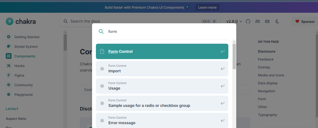
Search Functionality:
Integrate a robust search feature to help users quickly locate specific content. This is especially valuable when dealing with a vast amount of information, such as course materials in an e-learning app. Also, place the search bar where it can be easily discovered by the user as can be seen in this image.
Responsive Design
Responsive design is a core necessity to ensure excellent user experiences for users in modern web development. With the plethora of devices available for users, having responsive applications across different screens and resolutions can help keep your users happy. So in order to seamless user experience across various devices, following strategies:
CSS Flexbox and Grid:
CSS has key properties to help design adaptable layouts for the users. With flexbox and the Grid system, you can create dynamic grids and arrange elements in a responsive manner. For example, in a blog application, use flexbox to arrange articles in a column on larger screens and in a single column on smaller screens.
Media Queries:
With more users using mobile more than desktop screens, media query is an absolute necessity. So, you have to implement media queries to apply different styles and layouts based on the screen size. This ensures that your application looks and functions optimally on smartphones, tablets, and desktops.
Fluid Images:
Use CSS properties like max-width: 100% to ensure that images scale proportionally to the screen size. This prevents images from becoming pixelated on larger screens and maintains visual quality.
Touch-Friendly Elements:
Design buttons and interactive elements with touch interactions in mind. Ensure they are appropriately sized and spaced to accommodate tapping on smaller screens. For a specific guide on how you can implement Responsive Design in your application, you can check out this article.
User Feedback: Creating Interactive and Responsive Interfaces
Feedback is the lifeblood of interaction. Luckily there are several elements and attributes that provide additional guidance. Concepts like tooltips that provide context, hover effects that showcase interactivity, and real-time validation to prevent errors before submission are important in ensuring better user experience. So, here are specific examples of User Feedback enhancements in your web application.
1. Tooltips for Context:
For instance, when designing a form with a date input field, you can include a tooltip that appears when users hover over the question mark icon next to the field. This tooltip can explain the expected date format or provide tips on where to find the required information.

2. Hover Effects for Interactivity:
Hover effects can greatly enhance user interaction. Let’s take the example of a website’s navigation menu. When a user hovers over a menu item, it should subtly change in appearance to indicate it’s clickable. This visual feedback helps users understand that they can interact with the menu item. See instances below.
- First image shows the button without any interaction with it.
- And this second image changes the background color of the button to indicate interactivity
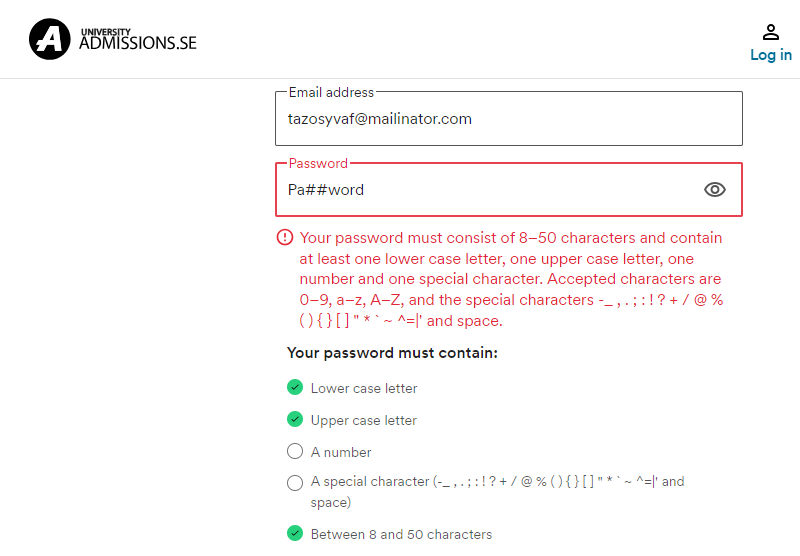
3. Real-time Validation for Error Prevention:
Real-time validation is crucial for preventing user errors. When a user is filling out a registration form, and they enter an invalid email address, the system should instantly provide feedback, highlighting the input field in red and displaying a message explaining the issue. This proactive approach guides users in correcting errors immediately.

4. Instant Password Strength Validation:
In line with the validation aforestated above, giving cues to users is also a powerful concept in facilitating better user experience. For instance, in the case of instant password strength validation, here is how it will play out. When a user creates or updates their password, there could be an implementation that analyzes its strength and displays a visual indicator (e.g., a progress bar or color-coded strength level) along with suggestions for improvement. This not only helps users create stronger passwords but also enhances security.
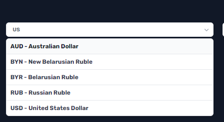
5. Interactive Form Elements:
When designing forms, think of making elements interactive. For instance, if a user needs to select their country from a dropdown list, you can make it searchable and dynamic. As the user types, the drop down should filter and display matching countries, making the selection process faster and more user-friendly.
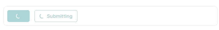
6. Feedback on Button Click:
When users perform critical actions like submitting a form or confirming a decision, provide immediate feedback. For instance, after a user submits a purchase order, show a confirmation message or animation to reassure them that their action was successful. Or if the user is making a request to the server, the button should change to indicate a loading state. This will prevent the user from making additional requests to the server and potentially clogging their network requests. See instance of how this could be displayed
Navigating Seamlessly: Designing Intuitive Navigation
Navigation is like a path for users on your application. That is why it should be intuitive, not confusing for them. To be more specific about this, let’s use an e-commerce site where intuitive navigation allows users to effortlessly locate products based on categories and filters. The key here is to ensure that users can easily find their way around your platform without feeling confused or lost. This involves some key considerations to have in mind.
1. Clear Labels and Categories:
It’s essential to label navigation options in a straightforward manner that reflects their purpose. For instance, if you’re building a recipe app, categories like “Breakfast,” “Lunch,” and “Dinner” should be clear and distinct. On a news website, instead of using vague terms like “Features” or “Highlights,” categories like “Technology,” “Health,” and “Entertainment” are more specific in helping users with navigation as can be seen below.

2. Hierarchy and Grouping:
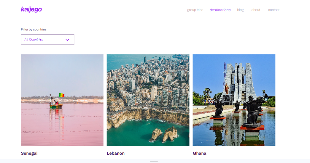
Another important concept is grouping related items together in a logical hierarchy. This helps users anticipate where they can find specific content. For instance, an e-learning platform might have a main category for “Mathematics” and subcategories like “Algebra,” “Geometry,” and “Calculus.” Also, a travel website could group destinations by continents, then further categorize them by countries and cities. For instance, Kaijego, a travel agency groups its destinations and information about them by countries.
3 Consistent Layout:
Maintain a consistent navigation layout across different sections of your platform. Users become familiar with the layout and can predict where to find specific information. To give an instance, if the main navigation bar is at the top of the page, it should stay there regardless of which section the user is browsing. This even makes for better development as you can easily abstract these into singular components that will be reused across the application.
4. Filter and Sorting Options:
For platforms with large amounts of content, provide filtering and sorting options to help users narrow down their choices. This is particularly useful for e-commerce sites, where users can filter products by price, brand, size, etc. For example: Allowing users to filter clothing items by size, color, and price range on a fashion e-commerce website. An instance would be this Shopify theme store that displays the theme categories for the users.

Guiding Users: Key Onboarding Strategies
Now, this phase is pivotal in shaping users’ perception of your application. Let’s explore the specific strategies for guiding new users during the onboarding process.
Interactive Tutorials and Walkthroughs:
For instance, in a project management tool, you could have a tutorial that demonstrates how to create tasks, assign them to team members, and track their progress. Similarly, in a fitness app, guide users through the process of customizing their workout plans and setting fitness goals step by step.
Personalized User Journeys:
Tailoring the onboarding process to individual user needs and preferences can significantly enhance their experience. For example, in an e-commerce app, new users might be presented with options to select their preferred product categories, thereby customizing their initial interaction within the app.
Contextual Guidance:
This involves offering assistance at the right moments to prevent users from feeling overwhelmed. In a cooking recipe app, as users browse recipes and ingredients, you could offer pop-up tips and explanations for cooking techniques and ingredient combinations.
Gamification Elements:
This process can make your application more engaging and enjoyable. For instance, in a financial budgeting app, users could be encouraged to complete certain tasks or goals in exchange for virtual rewards, badges, or points.
Progress Tracking:
Keep users motivated by displaying their progress and achievements during the onboarding process. In a habit-tracking app, users could see a visual representation of their consistency in completing daily tasks, reinforcing their commitment.
Inclusivity and Accessibility: Designing for All Users
Web Accessibility ensures that no user, (regardless of their abilities or disabilities) are left behind. Let’s look into some specific examples of how to achieve this:
Semantic HTML Elements
These elements not only provide structure to the content but also assist screen readers in interpreting and conveying the information accurately. For instance, using appropriate HTML tags like <header>, <nav>, <main>, <footer>, and <article> helps screen readers comprehend the layout and content hierarchy.
Alt Text for Images
Images can pose a challenge for visually impaired users. So descriptive alt text for images ensures that screen readers can convey these images to users who can’t see them. For instance, if an e-commerce website displays a product image, the alt text should succinctly describe the product’s appearance, features, and purpose.
Keyboard Navigation:
Not all users can rely on a mouse or touch screen to navigate a website. So, ensuring that every interactive element can be accessed and operated using keyboard shortcuts is helpful for better user experience. For instance, when designing a dropdown menu, developers should enable users to navigate through the options and activate them using the keyboard alone.
Color Contrast:
Color plays a significant role in design, but it can also hinder accessibility if not used thoughtfully. Making sure that there is sufficient contrast between text and background colors to accommodate users with low vision or color blindness. Utilizing tools to check color contrast ratios and making adjustments as necessary is crucial in maintaining readability. For a specific guide on how you can implement Accessibility in your application, you can check out this article on web accessibility.
Handling Mistakes Gracefully: Designing for Error Situations
Errors are inevitable, but there is no need for it to frustrate users. So there should be empathetic error messages that guide users toward a solution. Let’s explore some specific examples to illustrate how this can be achieved.
Forms:
Let’s say you have a sign-up form where users are required to provide their email address and complex password for registration. In this scenario, an instant error message would go beyond just indicating that there’s an error in the provided email format. Instead, it would offer helpful guidance to assist users in rectifying the issue. For instance: “Oops! Double-check that your email follows the format ‘example@email.com’.” Another example pertains to password creation. When a user attempts to set a new password, an error message related to password complexity can be designed in a way that educates the user while addressing the mistake. For instance: showing a progress bar as the user ticks off the required password format.
HTTP Request Errors:
In the context of web applications, HTTP request errors can occur due to various reasons, such as server unavailability, incorrect URLs, or timeouts. When handling such errors, it’s crucial to provide users with meaningful feedback that helps them understand the issue and take appropriate action. Here are a couple of examples:
- Server Unavailable: If a user encounters a server-related error, the message should convey that the problem is on the server’s end and not due to user action. For instance: “Oops! We’re experiencing a temporary glitch on our end. Our team is working to fix it.”
- Incorrect URL: When a user enters an incorrect URL or navigates to a non-existent page, the error message should guide them in the right direction. For example: "Hmm, the page you’re looking for seems to be missing. Make sure you’ve entered the correct URL or try searching from our homepage.” Having clear directions on how to proceed enables users to quickly recover from the error and continue exploring the website without feeling frustrated with your application.
Error Boundaries
Error boundaries are used to encapsulate components and prevent a single error from crashing the entire application. When an error is caught by an error boundary, a well-designed message can communicate the issue while maintaining a seamless user experience. Here’s an example: "Something went wrong with this section of the page. Our team has been notified, and we’re on it. You can try refreshing the page or returning to the previous page.”
Letting users know that their experience is still being actively managed and providing them with options to navigate or refresh, the error boundary message helps to mitigate the impact of the error on the user’s journey. For specific details on how to implement error boundaries,check out this article.
Keeping State in Sync: Effective State Management
Smooth user experiences hinge on seamless state management and luckily there are several management libraries in front-end development that can help. One powerful tool that developers can employ for global state management is Redux. Let’s take the example of a task management app to illustrate this concept further. In a scenario where a user is toggling between different tasks within the app, effective state management would involve synchronizing the state of the app across different components. This means that when a user toggles between tasks, the app should immediately reflect the changes without any noticeable delays or glitches. To achieve this, you can set up the Redux store to hold the relevant state information about tasks. When a user toggles between tasks, the corresponding action is dispatched to update the state in the Redux store. This change in state triggers a re-render of the relevant components, ensuring that the user interface accurately reflects the selected task without prompting the need for prop drilling which might have ensued in frameworks such as React.
Speed and Performance: Optimization for Seamless User Experience
An average user expects your website to load in milliseconds. Infact, statistics show that if your site loads for more than 5 seconds, you are likely to have a 123% bounce rate by visitors. With that in mind, let’s look into some specific strategies and examples for optimizing speed and performance:
Asset Optimization
Taking note of the sizes of assets such as images, videos, and scripts are crucial. The way around this is to compress images to the appropriate formats and resolutions without compromising visual quality. That could be optimized by using efficient image formats like WebP to reduce load times. For instance, instead of using a large PNG image for icons, converting them to WebP format can drastically decrease loading times.
Minimizing HTTP Requests
Every HTTP request adds a certain overhead to the loading time of a web page or application. Minimize the number of requests by combining CSS and JavaScript files, reducing unnecessary plugins, as well as removing unused images and videos. An example of this could be combining multiple CSS files into one to reduce the number of requests required to render a page.
Caching Responses
Implementing caching mechanisms can dramatically improve the load times of subsequent visits. Use browser caching, server-side caching, and Content Delivery Networks (CDNs) to store static assets. For instance, setting up browser caching for frequently accessed resources like CSS and JavaScript files can lead to quicker load times upon returning to the application.
Lazy Loading
Just imagine a website like unsplash with 5 million images waiting to fetch before the application loads for the first time. That will be a nightmare experience for any device. Now, this is where Lazy loading comes in. Lazy loading is a technique where images and components are loaded only when they are about to come into the user’s view. This approach speeds up the initial page load and conserves bandwidth. As users scroll down a page, images are loaded incrementally. For example, in a news feed application, images in articles could be loaded only when the user scrolls to that specific article. This concept can be powerful especially for applications that are image heavy. It can also be helpful for developers in reducing the bundle size of the applications as you would need to load only the specific component for the user. This in turns boosts the speed of the website, thereby ensuring an overall better user experience for your user.
Wrapping Up
The path to building a user centric application lies in understanding your users, empathizing with their needs, and implementing key steps that make their interaction with your application a delightful journey. With the strategies mentioned above, you can implement these practical tips on crafting web experiences that your users will treasure and return to time and again.
Leave a Reply