
Understanding Color Theory and Its Impact in UI/UX Design
.
8 minutes
Introduction
Welcome to the World of Colors in UI/UX Design!
In the vibrant realm of User Interface (UI) and User Experience (UX) design, color isn’t merely a decorative element; it plays a pivotal role in guiding, influencing, and engaging users. Understanding color theory is essential as it lays the groundwork for creating visually appealing and effective designs.
Importance of Color Theory
Color theory is a conceptual framework used in visual arts and design that explains how colors interact and how they can be combined to create specific visual effects or responses. In the context of UI/UX design, color plays several important roles, including:
-
Communication: Color conveys meanings and communicates ideas, helping users to understand and navigate the interface effortlessly.
-
Aesthetic Appeal: A well-chosen color scheme enhances the design’s visual appeal, providing a pleasant user experience.
-
Branding: Colors play a significant role in branding, helping to create recognizability and consistency across different mediums.
-
Accessibility: Understanding and implementing accessible color combinations ensures that your design is inclusive and accessible to all, including users with visual impairments.
UI & UX: Defining the Terms
-
UI (User Interface): UI pertains to the series of screens, pages, and visual elements (like icons and buttons) enabling users to interact with a product or service.
-
UX (User Experience): UX, conversely, encompasses all aspects of a user’s interaction with a company, its services, and its products. It focuses on the overall feel and experience of the user while navigating through the interface.
Purpose of this Article
This article aims to provide you with the foundational knowledge of color theory and shed light on its undeniable importance in UI/UX design. Through this guide, you will learn how to effectively utilize color to enhance the functionality and aesthetic of your designs, thereby creating interfaces that are not only visually captivating but also user-friendly and accessible. So, let’s embark on this colorful journey of learning and discovery together!
Basics of Color Theory
While diving into the fascinating world of colors, it’s crucial to grasp the basic principles that guide their use and combination in design. So, let’s start with understanding what color theory is all about!
What is Color Theory?
Color Theory helps designers to create aesthetically pleasing and impactful designs by understanding the relationships between different colors.
Brief History of Color Theory
Color Theory has its roots in the 18th century with Sir Isaac Newton’s color wheel. It has since evolved, with various artists and designers contributing to its development. The theory serves as a guide, offering a systematic approach to using and combining colors effectively.
The Color Wheel
The Color Wheel is a circular diagram of colors arranged by their chromatic relationship. It’s a practical tool that helps designers visualize how colors relate, providing a structure for thinking about color.
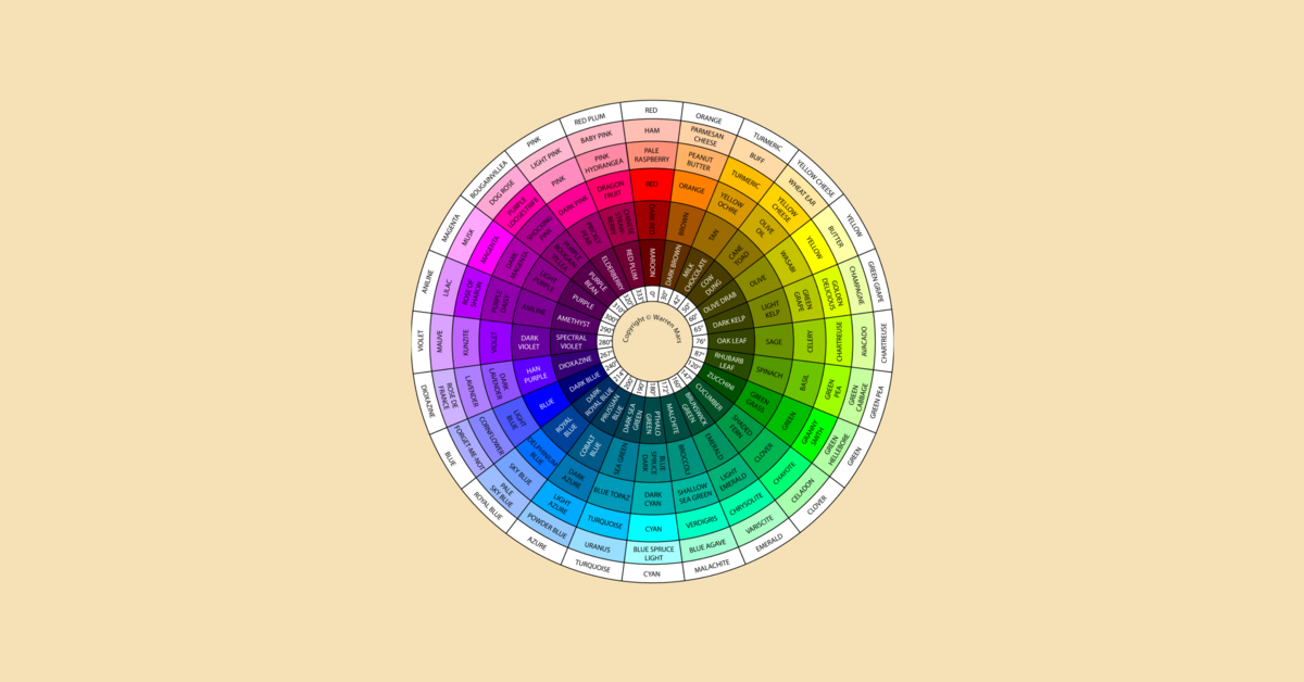
Image of the color wheel
Primary, Secondary, and Tertiary Colors
- Primary Colors: These are the base colors that cannot be created by mixing other colors. The primary colors are red, blue, and yellow.
- Secondary Colors: Created by mixing two primary colors. These include green (blue and yellow), orange (red and yellow), and purple (red and blue).
- Tertiary Colors: These are formed by mixing a primary color with a secondary color, resulting in colors like red-orange and blue-green.
Color Harmonies
Understanding color harmonies is key to creating pleasing color schemes in design.
Complementary Colors
Complementary colors are opposite each other on the color wheel. When used together, these colors create a high contrast, vibrant look. For example, red and green are complementary colors. It’s best not to use them side by side in design but they are great for highlighting or drawing attention to specific elements.
Analogous Colors
Analogous colors are next to each other on the color wheel. They usually match well and create serene and comfortable designs. For example, blue, blue-green, and green are analogous colors.
Triadic Colors
Triadic color schemes use three colors evenly spaced around the color wheel. This scheme is popular among artists because it offers strong visual contrast while maintaining color richness and diversity. An example is the primary colors red, blue, and yellow.
In the next sections, we’ll explore how these foundational principles of color theory are applied in UI/UX design to create engaging and effective user interfaces. Stay tuned!
Color in UI/UX Design
When crafting digital experiences, the judicious use of color is crucial. Colors don’t just make interfaces appealing; they also significantly impact a user’s interaction and experience with a product or service.
The Importance of Color
In the realm of UI/UX design, color is not just a decorative element but a communication tool:
- Visual Guidance: Colors guide users intuitively, highlighting important elements like buttons and calls to action, aiding in seamless navigation.
- Brand Identity: Consistent color schemes reinforce brand identity, fostering user trust and brand recall.
- Emotional Connection: Colors evoke emotions and reactions from users, influencing their perception and experience with the application.
Influencing Emotions and Behaviors
Different colors elicit different psychological responses. For instance:
-
Red: Often associated with passion and urgency, it can be used for warnings or to prompt users to take action.
-
Blue: It conveys a sense of trust and security, commonly used for finance or social media applications.
Choosing the Right Colors
Selecting the right colors is pivotal in creating an effective and engaging design. Consistently choose the most impactful colors by following these tips :
- Understand Your Audience: Color perception can vary widely, so it’s important to consider the cultural and demographic preferences of your target audience.
- Maintain Consistency: Consistency in colors fosters a coherent and professional appearance, enhancing user trust.
- Limit Your Palette: A limited color palette can lead to a cleaner and more focused design.
Color Psychology in UI/UX
Understanding color psychology is key to eliciting desired emotions and reactions from users. Every color can be categorized as either a warm or a cool color. Utilize their distinct characteristics to get the look you want
Warm and Cool Colors 101
Warm colors, like red and yellow, often evoke feelings of warmth and optimism but can also signal caution. Cool colors, such as blue and green, are calming and trustworthy but can also feel cold or impersonal.
Accessibility
Designing for accessibility ensures that your interface is usable by as many people as possible, including those with visual impairments.
Accessibility Tips
- Contrast Ratios: Ensure there’s sufficient contrast between text and background colors to maintain readability.
- Color Blindness: To ensure accessibility for users with color blindness, avoid relying solely on color for conveying information; consider incorporating textures or shapes as supplementary indicators.
- Testing: Utilize tools and resources to test your design’s color accessibility, adjusting as necessary to accommodate various visual impairments.
By understanding and applying these principles, you can craft interfaces that are not only visually delightful but also accessible and inclusive to all users.
Practical Applications
It’s essential to understand how the principles of color theory can be practically applied in real-world UI/UX design projects. In this section, we will explore some case studies, common mistakes to avoid, and useful tools for working with color.
Case Studies
To grasp how color theory can be effectively utilized, let’s take a look at some well-known applications and websites that have excellently incorporated color into their UI/UX designs:
-
Instagram: With a vibrant and inviting color scheme, Instagram effectively uses gradients that not only catch the eye but also resonate with the app’s dynamic and creative nature.
-
Slack: The communication platform utilizes a pleasing and relaxed palette of colors. Its signature purple sidebar is easily recognizable, aiding brand identity and user navigation.
-
Spotify: Known for its iconic green color, Spotify employs a dark theme that allows colorful album covers and playlists to pop, creating an immersive and engaging user experience.
Common Mistakes
Even experienced designers can occasionally slip up when it comes to using color. Here are common mistakes to watch out for:
- Overusing Color: Too many colors can overwhelm users and clutter the interface. Stick to a limited and harmonious color palette.
- Neglecting Contrast: Without adequate contrast, text may be hard to read, and important elements might go unnoticed.
- Ignoring Brand Identity: The colors should align with the brand’s identity and the product’s purpose, helping to create a consistent and cohesive user experience.
Tools and Resources
Various tools and resources can aid designers in selecting and testing color schemes effectively:
- Adobe Color Wheel: A powerful online tool that helps create color schemes and explore harmonies.
- Coolors: A quick and easy tool to generate beautiful color palettes.
- Contrast Checker: Test your text and background color combinations to ensure sufficient contrast for accessibility.
- Color Hunt: A platform that offers free and trendy color palettes for designers.
Conclusion of Section Understanding the practical application of color theory in UI/UX design is crucial for creating effective and aesthetically pleasing interfaces. By learning from successful applications, avoiding common mistakes, and utilizing handy tools, designers can confidently and creatively use color to enhance their projects.
Hands-On Exercise
Now it’s time to get your hands dirty and put into practice everything you’ve learned! In this section, we’ll walk through creating a color scheme for a fictional app and apply the principles of color theory to a UI/UX design project.
Creating a Color Scheme: Step-by-Step Guide
Imagine you are creating a fitness app that helps users track their daily exercise and meals. Let’s craft an engaging and soothing color scheme:
-
Understand the Audience: Since it’s a fitness app, our target audience is individuals who are health-conscious, ranging from beginners to fitness enthusiasts.
-
Select Primary Colors: Choose a primary color representing health and vitality. A fresh and energetic color like green can be a great choice. For example, use
#32CD32for Lime Green.

-
Pick Secondary Colors: These colors should complement the primary color. Consider a calming blue (
#4F94CD– Steel Blue) and a motivating orange (#FFA500– Orange). -
Choose Background and Text Colors: A light background with dark text offers the best readability. You could opt for a white background (
#FFFFFF) with dark grey text (#333333). -
Test Your Colors: Ensure the colors work harmoniously and are accessible. Use the tools mentioned earlier to test your color scheme.
Applying Color Theory Principles: Practical Exercise
-
Design a Landing Page: Use the colors selected above to design a landing page for the fitness app. The page should include:
- A header with the app’s name.
- A motivating tagline.
- Call-to-action buttons for ‘Sign Up’ and ‘Learn More’.
-
Apply Color Strategically:
- Use your primary color for important elements like the header and call-to-action buttons.
- The tagline can be in the secondary color to draw attention.
- Ensure enough contrast between text and background colors for readability.
-
Evaluate & Adjust: Reflect on your design. Does it communicate health and vitality? Is it engaging and accessible? Make adjustments to refine the color scheme until it effectively communicates the app’s purpose and is pleasant for users.
Practice Makes Perfect Remember, designing effectively with color comes with practice. So don’t be afraid to experiment with different hues, and always remember to test your designs to ensure they are accessible and appealing to your target audience. Happy designing!
Conclusion
You’ve made it to the end of this enlightening journey into the world of color theory and its pivotal role in UI/UX design!
Key Learning Points Recap
- Understanding Color Theory: We’ve delved into the basics of color theory, exploring the color wheel, primary, secondary, and tertiary colors, and different color harmonies.
- Importance in UI/UX: The application of color theory in UI/UX design is indispensable for enhancing user engagement, emotional response, and the user’s overall experience.
- Practical Applications: We analyzed well-executed color schemes in popular apps, learned about common mistakes, and explored useful tools for color scheme selection.
- Hands-On Practice: You got a taste of applying your newfound knowledge through a hands-on exercise creating a color scheme for a fictional app.
Keep Experimenting! Practice and experimentation are your best friends on the path to mastery. Engage in different projects, try various color combinations, observe the results, and refine your skills continually. Each project will offer new insights and broaden your understanding of using color effectively in UI/UX design.
Additional Resources
Continue Your Learning Journey
-
Books:
- “Interaction of Color” by Josef Albers: A comprehensive guide on understanding and working with colors.
- “Color Theory: An essential guide to color-from basic principles to practical applications” by Patti Mollica: A great resource for anyone looking to understand the basics and applications of color theory.
-
Online Courses:
- Coursera’s “Graphic Design”: Offers courses that delve deep into color theory and its applications in design.
- Udemy’s “Color Theory for Designers”: A course focusing on the practical aspects of color theory in design.
-
Websites:
- Colormatters: An excellent resource for everything related to color theory.
- Paletton: A color scheme designer tool that is invaluable for UI/UX designers.
FAQs
Frequently Asked Questions
-
Q: Can I use any color I want in my designs?
-
A: While you’re free to choose colors, it’s crucial to ensure they align with the brand, are accessible to all users, and provide a pleasant and intuitive user experience.
-
Q: How many colors should be in a color scheme?
-
A: Typically, a design should include one primary color, one secondary color, and a few accent colors. The exact number can vary, but simplicity and consistency are key.
-
Q: How important is color accessibility in designs?
-
A: Extremely important! Accessibility should be a priority to ensure your designs are inclusive and can be used by everyone, regardless of their visual abilities.
Final Thoughts As you continue to explore and experiment with color theory in your UI/UX design projects, always approach each project with curiosity and creativity. Happy designing!
Leave a Reply